


Key Takeaways
- Most CPG dashboards are built to report what happened, not to support what comes next. A dashboard that surfaces a margin compression problem six weeks after the decisions that contributed to it were made is a historical document, not a decision tool.
- The metrics that matter most to CPG CFOs — net revenue per SKU, trade spend efficiency, days inventory outstanding, and cash conversion cycle — are rarely the ones that come pre-configured in a standard financial reporting setup.
- A dashboard is only as reliable as the data that feeds it. Before investing in visualization, the more important investment is ensuring the underlying accounting data is clean, consistently classified, and updated on a cadence that makes real-time reporting meaningful.
- Bottom line: The goal is not a better-looking report. The goal is to reduce the distance between what the business is doing and what leadership knows about it.
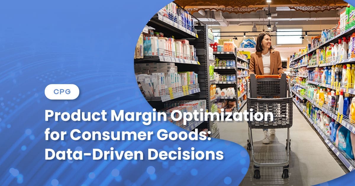
Consumer goods businesses generate a volume of transactional data that, left unstructured, tells no coherent story. Sales flow from three channels. Inventory is moving across multiple warehouse locations. Trade promotions are running simultaneously with different customers on different terms. Ingredient costs are changing across purchase orders. A month-end close that takes two weeks to complete, by which point half the decisions the data would have informed have already been made on instinct.
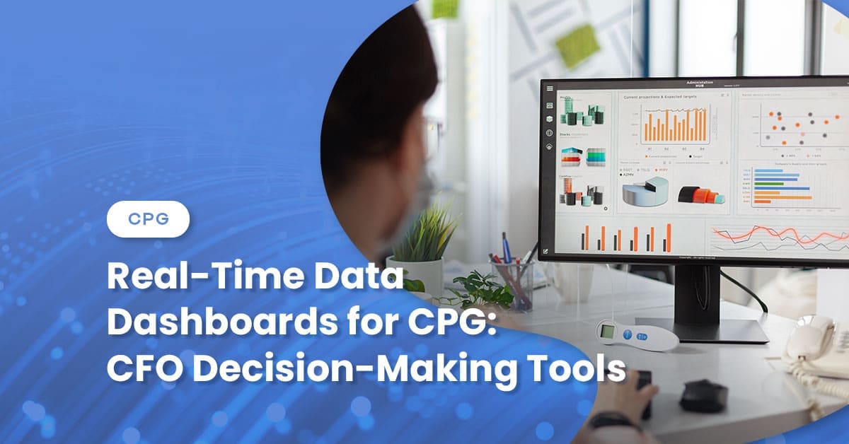
Real-time financial dashboards, built correctly, solve a specific problem: they compress the time between what the business is doing and what leadership understands. The key phrase is “built correctly.” Most CPG dashboards, in practice, solve a different and less valuable problem — they make historical data look better on a screen.
Here is what a genuinely useful CFO dashboard for a consumer goods business looks like, and what it requires to function.
The Metrics That Actually Belong on a CPG CFO Dashboard
The standard financial reporting package — revenue, gross margin, operating expenses, EBITDA — provides a summary of performance. It does not provide the diagnostic layer that tells a CPG CFO where that performance came from or where it is going.
The metrics that belong on a real-time CPG decision-making dashboard are those that sit between the summary and the transaction level: specific enough to be actionable, yet aggregated enough to be scannable.
Net revenue by channel, by SKU, and by customer. Gross revenue is the starting point. Net revenue — after promotional allowances, cooperative advertising, returns, and freight-to-customer — is the amount the business actually earned on each unit sold. A dashboard that reports gross revenue without netting these items creates a misleading picture of where margin is generated and where it is returned.
Trade spend as a percentage of net revenue by account. Trade promotion is one of the largest variable cost categories in CPG and one of the least visible in standard reporting. Surfacing trade spend efficiency by account — the total promotion cost relative to incremental net revenue generated — allows the finance team to identify accounts where promotional investment is driving volume versus those where it is simply maintaining placement at a negative contribution.
Days inventory outstanding (DIO) by SKU and warehouse location. Aggregate inventory turns tell you something. Lot-level DIO by SKU tells you which specific products are accumulating and where. For businesses managing expiration dates — food, beverage, pet, supplement — this metric is the early warning system for impairment before it becomes a write-down.
Cash conversion cycle. Combining DIO, days sales outstanding (DSO), and days payable outstanding (DPO) into a single metric gives the CFO a real-time read on how efficiently the business converts inventory investment into cash. A lengthening cash conversion cycle is an early indicator of cash pressure, often visible weeks before the bank balance signals a problem.
Gross margin bridge versus the prior period. A variance analysis that decomposes the change in gross margin into its component parts — volume, price, mix, input cost — answers the question that a single margin percentage cannot: is the change in margin being driven by something the business can control, or something it cannot?
Why Most CPG Dashboards Don’t Deliver
The failure mode for financial dashboards in consumer goods is almost always one of three things — and it is almost never the visualization technology.
The underlying data is inconsistently classified. A net revenue dashboard is only useful if promotional allowances, slotting fees, and cooperative advertising are consistently recorded as reductions of revenue rather than operating expenses — and if that classification is applied uniformly across channels, customers, and accounting periods. If the same type of trade spend is treated differently depending on which account manager submitted the expense report or which period the invoice arrived in, the dashboard will produce numbers that cannot be compared across time or across customers. The visualization makes the inconsistency more visible, not less damaging.
The data is not current enough to be actionable. A dashboard built on 30-day-old data is not a real-time tool. For most mid-market CPG companies, the constraint is not the reporting layer — it is the close cycle. When the month-end close takes two to three weeks, the “current” dashboard is showing last month’s business at best. Compressing the close cycle — through better accrual processes, automated reconciliations, and tighter accounts receivable workflows — is the prerequisite for meaningful real-time reporting. The dashboard is the output of that work, not a substitute for it.
It was built for the wrong audience. A dashboard designed to satisfy a board reporting requirement differs from one designed to support daily operational decisions. Board dashboards aggregate. Operational dashboards drill. A CFO who needs to understand why gross margin declined this week needs SKU- and customer-level drill-down capability, not a prettier version of the summary P&L. Building a single format and expecting it to serve both purposes produces a tool that serves neither well.
What Good Dashboard Design Actually Requires
A dashboard that genuinely supports CPG CFO decision-making has a few non-negotiable characteristics.
It shows actuals and trends together, not just point-in-time snapshots. A metric without context — gross margin this week is 38% — tells the reader almost nothing. Gross margin this week is 38%, compared to 41% in the same week last year and 40% last month, with the variance driven primarily by a mix shift toward the company’s two lowest-margin SKUs — that is a decision prompt.
It surfaces exceptions, not just summaries. The CFO does not need to see every SKU performing as expected. The dashboard should flag SKUs whose margins have moved outside a defined threshold, customers whose trade spend efficiency has deteriorated, and inventory lots approaching their minimum retail shelf life. Exception-based reporting focuses on the items that require a decision.
It connects financial metrics to operational inputs. Margin compression on a specific SKU is more actionable when the dashboard connects it to the relevant input costs — ingredient price changes on the last three purchase orders, co-manufacturer fee changes since the last contract renewal, and yield data from the most recent production run. Financial outcomes traceable to operational causes are resolved faster than those that require a separate investigation to understand.
CFO Tech for Enhanced Visibility
Real-time dashboards are not a technology problem for most CPG companies. They are data quality and process problems that, once resolved, make the technology straightforward. The CFOs who get the most value from financial reporting tools are generally those who have invested in the accounting infrastructure first — clean classification policies, disciplined close processes, consistent cost allocation methodologies — and treated the dashboard as the natural output of that work.
The result is a finance function that spends less time explaining what happened and more time shaping what happens next.
The Wiss CPG advisory team works with consumer goods companies on financial operations, reporting infrastructure, and the accounting discipline that enables real-time insights. If your data isn’t working as hard as your business, let’s talk.